Page 1 of 2
UK cover art?
Posted: Wed Aug 22, 2007 2:30 am
by psytech
Noticed that home page of stephenrdonaldson.com seems to have what appears to be the cover for the UK edition. Interesting. A mountain scape in the background reflected to the foreground by a body of water. In silver (gray?) with gold highlights.
Posted: Wed Aug 22, 2007 2:43 am
by Seareach
Yeah, I really like it!

Posted: Wed Aug 22, 2007 2:49 am
by kevinswatch
Yes...*anything* is better than the US art. Heh.-jay
Posted: Wed Aug 22, 2007 8:03 am
by dlbpharmd
kevinswatch wrote:Yes...*anything* is better than the US art. Heh.-jay
I don't know about that - I don't like the UK cover either.
Posted: Wed Aug 22, 2007 8:12 am
by Avatar
At least its more consistent with the Runes cover...
--A
Posted: Wed Aug 22, 2007 1:56 pm
by Jussi

I like this cover.
Posted: Wed Aug 22, 2007 3:36 pm
by dlbpharmd
Avatar wrote:At least its more consistent with the Runes cover...
--A
True.
Posted: Wed Aug 22, 2007 5:29 pm
by aliantha
Oooh, I *like* that. Hey, maybe SRD would sell more in the US if his US publisher would use the UK covers!

Must be the resolution on my stupid monitor here at work -- I can't read the quote or who it's by.

Posted: Wed Aug 22, 2007 5:36 pm
by I'm Murrin
It's not a good scan. I believe it says: "Something entirely out of the ordinary," The Times.
Posted: Wed Aug 22, 2007 6:40 pm
by emotional leper
I think it either depicts Gilmermere, or, I can't recall exactly, the place in RotE where Linden shared the Horserite. Or possibly, the mountains in the distance are Skyweir (if I recall correctly,) and the lake is a lake of earthblood?
Posted: Fri Aug 24, 2007 6:02 pm
by Niftium
That picture did it it - I'll now officially be ordering the rest of the Last Chronicles from the UK. Hopefully I'll still be able to pick up a UK copy of RotE too.
Posted: Sun Aug 26, 2007 11:34 am
by TWDuke77
Have to say I think the colour of this cover is awful, a kind of bluey gray if the publishers blad is anything to go by. Glad the style is consistent but was really hoping they'd go for a much more striking colour like red or green (see the similarly designed blue of the Mordant's Need reissue - beautifully done!). As a bookseller, this new cover is going to be VERY hard to display attractively.

Posted: Sun Aug 26, 2007 11:52 am
by Seareach
Oh, I assumed it was black with gold and silver (like the Runes copy). I hope it's not bluey gray!

Posted: Sun Aug 26, 2007 12:22 pm
by TWDuke77
Well it looks like black, gold and silver on the image posted by Jussi and I sincerely hope it is and that the representation I saw was inaccurate, but I've got a bad feeling... Such a shame as well since Gollancz put so much effort into ROTE. Even the pb edition was brilliant, classy and simple, but with its clever reference to the original UK covers in the circular motif.
Still, so long as we don't judge a book by its cover, it shouldn't matter anyway, right?
Posted: Fri Aug 31, 2007 7:32 pm
by Ard Rhys
That's ugly as all fugh.

The UK covers are atrocious, I think. The only thing they have going for them is uniformity, and who wants ugly uniformity. haha
Posted: Tue Sep 04, 2007 12:10 pm
by Usivius
wow, that's strong.
I like the UK covers a lot. Not just for their unifmormity to each other in the series, by they hint, rather than attempt show, which is what I like.
Nothing worse than a cover with an artist's visual interpretation of a scene or character that totally conflicts with your own personal mind's-eye view...

Posted: Thu Sep 06, 2007 7:25 pm
by dANdeLION
kevinswatch wrote:Yes...*anything* is better than the US art. Heh.-jay
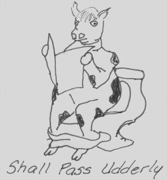
Really? How about this?

Posted: Fri Sep 07, 2007 12:37 pm
by Usivius
Posted: Fri Sep 07, 2007 2:24 pm
by aliantha
He's milking that drawing for all it's worth...
(Dammit! Cheval already beat me to this pun in the other forum!

)
Posted: Thu Sep 13, 2007 3:25 pm
by Jussi
New version from Amazon UK:


