Dust Covers

Book 1 of the Last Chronicles of Thomas Covenant

Moderator: dlbpharmd

Post Reply
Glaive
Stonedownor
Posts: 34
Joined: Fri Oct 29, 2004 2:06 pm

Dust Covers

Post by Glaive »

"You can't judge a book from it's cover..."

Well, I believe a lot of people are doing JUST that...I first saw the cover and thought, "Oh, look..the new Robert Jordan book is out! His fans will be pleased!", then I read the title...my hands immediatey went and snached it from the shelf and my legs turned to propel me to the cash register. Before I knew what was happening, I'd handed over a large sum of cash for said book and even as I walked toward the tram my hands were stroking it through the plastic bag. On said tram, I again turned to the drab cover...my heart sank, then I read the title and author again and cracked the book open, beginning to read the prologue. On returning home, I took the dust-jacket off (it's worth more if the jacket isn't worn) and secreted it in a drawer. After finishing said book and being on these forums for a whilke I've gone back to look at the jacket, and to place it in context...

Damn, it's boring...

Any ideas what it's portraying?

The best covers were DEFINITELY done by Peter Goodfellow for the seven European editions...strong graphics, with a hint of story.

Hope he's not dead, I WANT this guy back!! :D [maybe EVEN moreso than Covenant.}

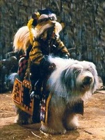
The cover shows three people, I'm guessing Linden, Liand and Stave (forgotten the name of the horse)...but why the HELL would Linden be wearing a DRESS? Doesn't she ALWAYS wear a shirt and jeans??! ...and where's Anele?...as far as I can see this is the only scene this could be describing....David Eddings crap!!


...apologies to David Eddings fans...
User avatar
High Lord Tolkien
Excommunicated Member of THOOLAH
Posts: 7393
Joined: Tue Oct 19, 2004 2:40 am
Location: Cape Cod, Mass
Been thanked: 3 times
Contact:

Post by High Lord Tolkien »

I prefer vague covers like the current Runes to the more descriptive ones that actually show the character's faces.
Leaves more to the imagination.
I'm one of those odd-balls that will judge a book by its cover.

I did shake my head at some new cover lunacy though.
The newest batch of 1st Chronicle covers here in the States has...are you ready for this?.......a *gold* ring on all 3 covers!

I guess maybe they were hoping to draw in some Lord of the Ring fans?
8O
https://thoolah.blogspot.com/

[Defeated by a gizmo from Batman's utility belt]
Joker: I swear by all that's funny never to be taken in by that unconstitutional device again!


Image Image Image Image
User avatar
drew
The Gap Into Spam
Posts: 7877
Joined: Sun Sep 12, 2004 4:20 pm
Location: Canada
Been thanked: 1 time
Contact:

Post by drew »

...uh Linden is the one in th plaid shirt and jeans. I think it's Linden Anele and liand...and Anele is wearing a robe.
User avatar
I'm Murrin
Are you?
Posts: 15840
Joined: Tue Apr 08, 2003 1:09 pm
Location: North East, UK
Contact:

Post by I'm Murrin »

Do the smart thing: buy UK editions.
User avatar
phantomcougar
Servant of the Land
Posts: 9
Joined: Sun Oct 10, 2004 12:10 am
Location: Silsden, West Yorkshire

Post by phantomcougar »

I bought the US edition from Amazon because the pictures of the UK edition look very dull, all black with pictures of sticks on it. Now "Runes" is in the bookshops over here in the UK and the UK edition is gorgeous. The paper of the dustcovers is textured and the whole book is much better presented than the US one. I am going to see SDR at a signing in Manchester tomorrow night. I'm not taking my US one to get signed I'll be buying the UK one. Don't reckon much to the maps though
Cougars have claws!
User avatar
drew
The Gap Into Spam
Posts: 7877
Joined: Sun Sep 12, 2004 4:20 pm
Location: Canada
Been thanked: 1 time
Contact:

Post by drew »

Donaldson had stated that the maps were a rush job...They were rushing the novel and didn't have time to re-map the whole land.

I think they should have just left them out....the map of REvelstone doesn't show a thing!---It's kind of like the Maps the The One Tree---nice to look at....no help to desscern where anything is. (I know I didn't need a map the show me that the third trunicate was on top of the second.)
User avatar
burgs
The Gap Into Spam
Posts: 1044
Joined: Mon Jul 12, 2004 3:59 pm
Location: Chicago

Post by burgs »

I have both the UK and the US copies (yeah, I'm a geek), and even my roommate, who isn't a fan of the genre whatsoever, took one look at the two books and said: "This version (the UK version) looks like a *real* book. The US version looks like a parodic comedy."

The entire UK version is vastly preferable to the US edition. It even *feels* more like a book.
"Life shrinks or expands in proportion to one's courage." (Anais Nin)
Glaive
Stonedownor
Posts: 34
Joined: Fri Oct 29, 2004 2:06 pm

Post by Glaive »

drew wrote:...uh Linden is the one in th plaid shirt and jeans. I think it's Linden Anele and liand...and Anele is wearing a robe.

ARRRGGGHHH!!

You're absolutely correct!

Sorry, my bad!

(Still a boring cover, though...)
User avatar
burgs
The Gap Into Spam
Posts: 1044
Joined: Mon Jul 12, 2004 3:59 pm
Location: Chicago

Post by burgs »

Remember that this is Michael Whelan, and his covers are often not depictions of actual characters or scenes - he goes, rather, for effect.
"Life shrinks or expands in proportion to one's courage." (Anais Nin)
Glaive
Stonedownor
Posts: 34
Joined: Fri Oct 29, 2004 2:06 pm

Post by Glaive »

Unfortunately, a bloody BORING effect!

Bring back Goodfellow!!!
User avatar
burgs
The Gap Into Spam
Posts: 1044
Joined: Mon Jul 12, 2004 3:59 pm
Location: Chicago

Post by burgs »

Personally, I loved the entire presentation of the UK book. It was very classy.

This was just a run-of-the-mill fantasy preparation which, frankly, I'm tired of. How will fantasy ever be taken seriously with all of this over the top cover art?
"Life shrinks or expands in proportion to one's courage." (Anais Nin)
UrLord
<i>Haruchai</i>
Posts: 553
Joined: Thu Oct 09, 2003 3:40 pm
Location: Houston
Contact:

Post by UrLord »

I don't know, I liked this one significantly more than the original ones (by Sweet, I believe) that depicted Hunchback Covenant's gaping-mouthed journey through a Land filled with bizarre looking people.
Anyone perfect must be lying, anything easy has its cost, anyone plain can be lovely, anyone loved can be lost.
Funky Staff of Law
Servant of the Land
Posts: 15
Joined: Fri Nov 12, 2004 2:55 pm

Post by Funky Staff of Law »

I think the UK cover looks great, I can't stand Fantasy books that have Mills and Boon esque covers of the characters standing in an impressive landscape looking dashingly over a panoramic vista.... total crap.
User avatar
burgs
The Gap Into Spam
Posts: 1044
Joined: Mon Jul 12, 2004 3:59 pm
Location: Chicago

Post by burgs »

UrLord wrote:I don't know, I liked this one significantly more than the original ones (by Sweet, I believe) that depicted Hunchback Covenant's gaping-mouthed journey through a Land filled with bizarre looking people.
Sweet's stuff is horrid. Of course I have no artistic ability, but are there really so few talented artists willing to draw fantasy covers? His destruction of The Wheel of Time covers is despicable.

I wish more fantasy covers were like the UK version. The genre would raise in credibility fairly quickly.

Think of recent LOTR covers. They're artistic, but respectable.
"Life shrinks or expands in proportion to one's courage." (Anais Nin)
User avatar
I'm Murrin
Are you?
Posts: 15840
Joined: Tue Apr 08, 2003 1:09 pm
Location: North East, UK
Contact:

Post by I'm Murrin »

Unfortunately I picked the book off the shelf today only to realise that the nicely textured UK cover is so soft it's actually starting to wear through on the edges. *sigh*
User avatar
drew
The Gap Into Spam
Posts: 7877
Joined: Sun Sep 12, 2004 4:20 pm
Location: Canada
Been thanked: 1 time
Contact:

Post by drew »

My favorite cover of any of the TC books, is Lord Fouls Bane, the one with the Ranyhin running through the plains of ra. mostly because there is nobody in it. The scenery is great, and it touches on the story ever so much...plus the Pretty Horses are what atttracted my sister to it when she bought it for me for Christmas oh so many years ago.
User avatar
High Lord Tolkien
Excommunicated Member of THOOLAH
Posts: 7393
Joined: Tue Oct 19, 2004 2:40 am
Location: Cape Cod, Mass
Been thanked: 3 times
Contact:

Post by High Lord Tolkien »

Look at the UK Edition cover of tRotE.
Stare at it for a few moments and then squint your eyes.
I see WORDS!
The tree limbs make WORDS!

I don't know what words they are though.
"Covenant" maybe?

Hahaha!

Well, I do see something.
I see...dead trees.

Arrghh!, how long until the next book comes out? :x
https://thoolah.blogspot.com/

[Defeated by a gizmo from Batman's utility belt]
Joker: I swear by all that's funny never to be taken in by that unconstitutional device again!


Image Image Image Image
Post Reply

Return to “The Runes of the Earth”